Finally, a Breakthrough!
July 13, 2019 |I won't lie, I was sorely tempted to completely abandon the work I've done on my website and switch over to a sleek, pre-made template yesterday. I'd reached a point where I felt immensely frustrated by my lack of design skill, and was dismayed by the hours spent trying out new designs only to have them look jarring and sophomoric.
But boy, am I glad that I stuck it out.
These were the primary design issues that I'd been trying to solve:
- Revamp the home page with a simple, aesthetically pleasing welcome message
- Fix the visual rendering of my site so that it would load properly on mobile devices (ie not ultra zoomed out and difficult to read)
- Restructure various containers throughout my site so that they would collapse and stack vertically on smaller screens
To my immense frustration, I spent three fruitless hours trying to address these issues after work yesterday. And by the end of the evening, I had absolutely nothing to show for my efforts. I though about writing a blog post last night, but decided against it as I was just sick to death of this project and thought a good night's sleep would give me the inspiration I needed.
And that's exactly what it did.
Today was probably the most productive day I've had working on this site. It continues to amaze me how time just melts away when I really get on a coding hot streak. Somehow, five hours of this afternoon just flew by in an instant, and I was left with a website that, in my opinion, is the closest to its finished form as it's ever been.
For my home welcome page, I found a 50% opaque solid black fill to be superior to any of the other background images I had tried to that point. It blends well with my background image, provides a nice contrast to my text color, and is much simpler to load than an external picture.
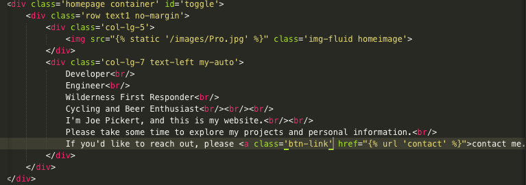
Similarly, the issues I was having with my containers failing to collapse on mobile devices had a rather straightforward solution. First, I needed to add an additional specification to my 'col' classes within the Bootstrap-based structure of my HTML templates. As you can see in this code snippet:

I added 'lg' the col portion of my div classes. In the Bootstrap framework, this detail specifies a certain screen size at which to switch the layout of the designated columns from inline to stacked.
Additionally I had to add the meta tag to the header of my base HTML template. This essentially instructs the browser to load my website at the specific resolution of the device trying to access it. In combination, these two bits of code seamlessly solved my issues with mobile compatibility, and I finally have a site that I would be proud to show someone of my cell phone.
In addition to these improvement, I also made significant strides in cleaning up my website's code in general. I started by fleshing out the header of my base HTML:

With important information such as meta tags that describe the contents of my site. I believe that they're also related to search engine optimization, but I need to research this further before I say anything conclusively. Perhaps that's a topic for a future blog post!
Additionally, I finally got around to compiling all of my custom Javascript functions in a separate, custom.js file within my static directory. While keeping each function as a
 Hello!
I'm Joe Pickert, and welcome to my blog.
Here, you can find a collection of my thoughts both tech-related and otherwise.
If you find something that interests you, please leave a comment! I'd love to hear your thoughts and feedback!